The Voice of the Customer: Visualizing the User Experience with Interaction Dashboards
Turning 100,000+ user voices from across the U.S. into clear, actionable insights.
Role: Senior UX Designer (UX Research, UX & UI Design) • Date: June 2024 - November 2025
The Problem
With thousands of data points and user voices spread across hundreds of touchpoints as a result of their Voice of the Customer (VoC) program, Department of State stakeholders lacked a single, trusted place to explore insights, connect patterns, and confidently inform high-stakes decisions.
The Results
Delivered 20+ dashboards across 4 workbook sets adopted by over 4,000 Department of State employees across Passport Services, Travel.State.gov, and Overseas Citizen Services, saving hours each day in data exploration, interpretation, and reporting.
The Solution
Designed a suite of accessible, interactive Tableau dashboards for the Voice of the Customer (VoC) program that transformed continuously updated data into clear groupings and narratives, enabling stakeholders to both understand the full user experience and independently explore insights.
Initial architecture defined for conceptual groupings of data points in August 2024 - giving us a starting point for how we would be converting these from numbers to visuals. (Click image to expand)
The final wireframe architecture output by November 2025, including linked homepages that allowed users to explore connections between each “set” of dashboards, defined by service type (Passport Services, Overseas Citizen Services/Travel.State.Gov, and Internal or OMB Dashboards) (Click image to expand)
Discovery: Start and End with Foundational Architecture
In my first months on the team, I partnered closely with stakeholders, data analysts, designers, and researchers to make sense of a large and fragmented volume of user feedback. Rather than jumping straight into solutions, I focused on deeply understanding the Voice of the Customer (VoC) program; learning about what data existed, how it was collected, how it was used, and how it informed decision-making.
This discovery phase was essential to aligning on the project’s true goals and ensuring the dashboards we designed would be meaningful, trusted, and actionable. To build that foundation, I asked questions across several key areas:
Program context and history
When and why were VoC surveys introduced?
What had already been created, tested, and used prior to this effort?
User touchpoints and data inputs
What does each survey or touchpoint ask of users?
Where does each survey appear in the user journey (before, during, or after a transaction)?
What type of data does each touchpoint yield (qualitative, quantitative, or both)?
Data structure and governance
How often is data refreshed and reported?
Are there benchmarks, thresholds, or success metrics tied to specific data points?
What outcomes or decisions rely on this data?
Insight delivery and decision-making
How are insights currently visualized and shared?
How do these visualizations support (or fail to support) decision-making?
Accessibility and data literacy
What is the data literacy level of our partner teams?
How can visualizations be designed to be more intuitive, inclusive, and accessible?
Given the scale and complexity of feedback across channels, our first goal became clear: thoughtfully organize the data into coherent stories that stakeholders could easily understand, explore, and act on.
Creating the Blueprint: Style Guide & Components
Style guide highlights including primary, secondary and tertiary colors, and a guide to how to use them in context, as well as some 508 accessibility principles. (Click image to expand)
Additional highlights from our style guide that include the spacing and layout of our base dashboard templates. (Click image to expand)
Using Figma, our team designed a set of foundational dashboard templates to serve as the system backbone for all future work. By establishing a base layout and style guide covering structure, color, typography, and interaction patterns, we created consistency across dashboards while preserving flexibility to evolve as needs changed.
After completing the initial user research and insight-gathering phase, we applied these templates by redesigning several existing dashboards. This allowed us to validate the system early and ensure alignment between design and implementation. Using Figma, Tableau, and a Tableau plugin that enabled direct dashboard integration, we efficiently translated designs into functional, scalable dashboards. We were able to continuously adjust these over the year and a half we worked on them, allowing us to improve the user experience, accessibility, and efficiency.
Components ranging from sidebars and subsequent tabs/icons to callout overlays, filters, and status updates. (Click image to expand)
Out with the Old, In with the Blue
Once the style guide and core components were established, our next goal was to rework existing dashboards using the new Tableau dashboard framework. This allowed us to bring previously created dashboards into a more consistent, scalable system.
Below is an example of an original dashboard alongside its updated version, redesigned to align with the visual standards, interaction patterns, and storytelling needs of Passport Services.
The original Passport Trust Snapshot dashboard (some details redacted). (Click image to expand)
The most recent Passport Trust Snapshot dashboard (numbers shown are random as this is a template design). (Click image to expand)
The template showing the open, expanded sidebar. (Click image to expand)
Designing Within Tableau & The Developer Hand-off
During my time on the team, I focused on learning Tableau as deeply as possible. While it imposes certain design constraints, being able to work in Figma and then translate designs directly into Tableau helped make hand-offs seamless.
Designing data visualizations often comes with assumptions, such as thinking a graph with 29 bars, text, and graphics will fit perfectly. In practice, these assumptions are usually incorrect. Tableau’s constraints required designing mock-ups with realistic sample data, which I managed by creating small, structured datasets of the necessary dimensions and measures.
By delivering fully packaged Tableau files including layouts, assets like SVGs, and copy, developers could focus solely on data setup, backend development, and coding. This approach minimized visual QA issues, sped up iteration, and allowed the team to drop in the data without rebuilding design elements. The process ensured that dashboards were refined on the first pass, saving time and reducing errors.
An example of a blank template created for our developers to showcase large bar charts. (Click image to expand)
Another example of a template made with a more complex set of data involving multiple data sources and visualization types. (Click image to expand)
Integrating Our Personal LLM into Our Dashboards
Some conversations regarding the modeling done by our prompt engineer, and screenshots of his findings after doing testing. (Click image to expand)
One of our team’s key goals was to develop a dashboard powered by an LLM designed to identify sentiment and key themes from qualitative customer feedback.
During development, we stayed closely involved in the process to understand how the model generated themes and sentiment evaluations. This understanding was critical for integrating the model into the dashboard in a way that would be actionable and meaningful for end users.
Design, development, and research collaborated to create the first dashboard for Passport Services. It leveraged feedback from a post-transaction survey to surface key aspects of the Passport customer experience. The dashboard was designed to meet several core user needs:
Visualize sentiment breakdown by percentage of users (positive, negative, mixed, neutral)
Identify key themes and see the feedback that informed them
Explore themes filtered by sentiment, such as “Top 30 themes for positive feedback,” along with supporting comments
We started with low-fidelity mockups to guide development of a proof of concept. Through iterative collaboration using Figma, we refined the design until developers had a clear blueprint to build from.
Our AI-produced quick mockups and low-fidelity design experiments. (Click image to expand)
Low-fidelity proof of concept (Click image to expand)
The resulting proof of concept quickly evolved into the final product, which was deployed to over 1,000 views on the first day. Stakeholder feedback highlighted excitement and confidence in the tool, as well as interest in what else we could be evaluating in this way. The final dashboard also served as a blueprint for other programs using the same model, creating a consistent, user-friendly experience while allowing stakeholders the freedom to explore and draw their own conclusions.
The high-fidelity final design. (Click image to expand)
The final dashboard in Tableau. (Click image to expand)
Iterations & Research
Dashboard Resizing
When we began designing the dashboards, we initially set a standard screen size of 1600x900, which aligned with typical computer displays and balanced readability with screen real estate. Tableau offers an auto-resizing option, but it is not fully responsive and cannot adjust individual elements based on screen size or aspect ratio. To maintain consistency, selecting a single static size initially seemed like the best approach.
However, in-person research and testing revealed that the average Department of State-issued laptop was smaller than the ones we used as contractors. This led us to reduce the dashboard dimensions to 1400x800, requiring us to carefully prioritize content and restructure layouts to maximize what could fit on the screen.
We explored multiple layout options through five moderated user tests and one stakeholder focus group. I compiled a final report for our leads summarizing the testing results, comparing all options, and recommending the most effective layout moving forward. Images below can be opened in a larger window for more detail.
Background context from report. (Click image to expand).
Preferred choice evaluation from report. (Click image to expand).
Final summary of preferred choice from report. (Click image to expand).
Moderated user testing notes on Figjam. (Click image to expand)
2. Evaluating PowerBI
Another significant effort for our design and development teams came in June 2025, when we were asked to evaluate whether PowerBI might be a better option than Tableau. The request came from our project lead rather than stakeholders, and the task for a developer and myself was to explore what it would take to fully recreate at least two dashboards from scratch while preserving as much existing functionality and user experience as possible.
We approached this systematically, leveraging tutorials, documentation, and hands-on experimentation within PowerBI, while collaborating closely to identify opportunities, limitations, and potential trade-offs. The outcome was a detailed impact assessment that clearly outlined the effort required, potential benefits, and risks. Our evaluation demonstrated that the transition would require substantial work with minimal gain, enabling project leadership to make an informed decision to continue using Tableau and focus on delivering value to our users.
My final assessment concluded:
“Switching from Tableau to Power BI would disrupt our established workflows, forcing us to rebuild our design system from scratch. Tableau’s container-based structure and Figma-to-Tableau templates allow us to create consistent, scalable dashboards efficiently, saving time and reducing errors. Power BI lacks these features, requiring manual adjustments for every element, which would slow development, increase inconsistencies, and add unnecessary complexity to even basic design tasks.
The absence of containers and reliance on layers would make managing layouts tedious and error-prone, while Power BI’s rigid navigation, limited styling tools, and lack of integrated filters would require cumbersome workarounds. These inefficiencies would cause delays, strain team resources, and create stress for designers and developers alike, ultimately compromising the quality and usability of our dashboards. For a design-driven team, this transition would be a costly step backward, impacting productivity and morale.
Given the absence of a corporate or team-level mandate for this change, and with no clear net-positive impact on our business outcomes or development workflows, this transition appears to be an unnecessary and costly disruption to a team that is already operating efficiently, delivering high-quality results, and providing a familiar, user-friendly experience to our users.”
Figjam compilation and design-related evaluation/comparison of features. (Click image to expand)
Part 1 of final impact statement .(Click image to expand)
Part 2 of final impact statement (Click image to expand).
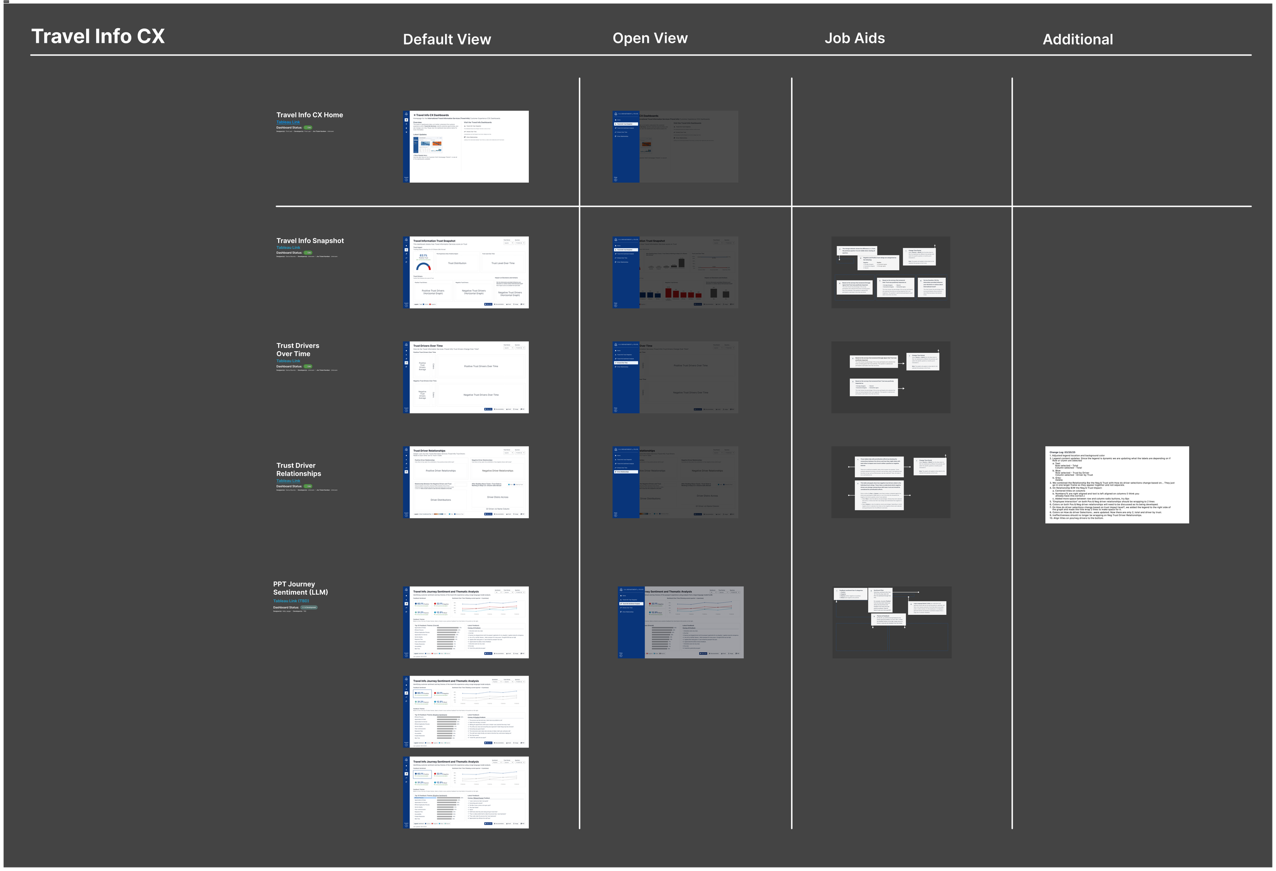
Final Voice of the Customer Dashboards
Over a year and a half, I helped design and develop 20+ dashboards serving over 4,000 Department of State employees. These dashboards transformed complex, fragmented user feedback into clear, actionable insights, highlighting sentiment, key themes, and user experiences.
By creating a reusable design system, integrating advanced analytics like an LLM model, and iterating based on user research, we delivered a consistent, accessible, and scalable solution. The final dashboards empowered stakeholders to explore insights independently, make informed decisions, and set a blueprint for future government programs. I’m extremely proud of the work I completed on this project and hope the templates, guides, and UX patterns we set can be used across the Department for years to come.