Giving To-Do’s More Power
Improving Buildertrend logo churn through accelerated tool adoption.
Team Role: Product Designer (UI, UX Design & UX Research) • Date: June - November 2023
The Solution
Create a simpler onramp for users to find value: improve the time-to-value of the To-Do feature by simplifying the user interface and adding key features that give the user back more time and control.
The Problem
Research found data to suggest that a large majority of our logo churn happens as a result of failed project management tool adoption. Simply put, these tools were not usable enough to make valuable.
The Results (1 Year Later)

To-Do (inline creation) is currently used between 1,000 and 1,500 times per day.
From August 2023 to March 2024, it was used 160,000 times.
The time-to-goal was reduced by 11 seconds per To-Do created.
In an initial 3 month pre and post release comparison, 5,000 more To-Do's were created than the previous period.
Onboarding data shows 9.9% more accounts are utilizing To-Do’s than this time last year.
While Buildertrend offers a plethora of services for its users, one of the cornerstones of the platform is its project management tools (think scheduling and to-do lists), and it became excruciatingly obvious that these features’ usability were failing our users.
Company-wide research showed that after initial onboarding, 37% of all new users create a To-Do as their first task. Research also showed that logo churn for a large portion of our new users was inevitable (for a variety of reasons), but we saw that those who were able to buy into our project management tools early and often (ie. creating a To-Do, or a schedule item) churned far less often as a result of that value add.

Here lies our mission to improve To-Do’s, where we chose to focus on key metrics like time-to-value (“How might we make creating a To-Do faster?”) and usability heuristics like consistency + standards (“What would a new user expect from a To-Do?”), and aesthetic + minimal design (“What can be taken away to give more focus to the important fields?”)
Problem Statement: Buildertrend is intended to be adoptable and exceed expectations in relation to project coordination and task management. We have observed that Buildertrend’s To-Do management system isn't meeting those expectations which is causing an early dip in confidence for new users.
Hypothesis: We believe that by providing an introductory task management experience through our existing To-Do’s feature, our customers will have a simpler onramp to finding value. This should lead to expanded and more frequent adoption, and increase early retention.
Synthesized Feedback
With quite a pile of past research to comb through, we were tasked with about 2 weeks to conceptualize a base “ideal” we wanted to work towards and then chunk out user stories for about 3 months of upcoming sprints. I went through and identified all of the most popular user feedback we had in EnjoyHQ and Uservoice, noting what features our users are looking to see:
A quick and dirty affinity mapping of different opportunities we could explore to improve the To-Do process (click the image to see more details).
Checklist Item Features (delete, assign, copy, print)
Sub/Vendor Permissions Functionality (Only completing checklist items instead of To-Do’s)
Ability to Filter by Date Created (List View)
New views like Assigned to Me
Printing To-Do’s with Checklists (Show Only Incomplete Checklist Items/To-Do’s)
To-Do List not tied to job (“Planner” or “My To-Do’s” vs “Assigned to Me”)
Mass Reassign/Auto Assign Capabilities (List View)
Design: The Light at the End of the Modal
Before exploring any new features, I spent about a week stripping back what we currently had and taking a more abstract view of what a To-Do looks like, versus what do our To-Do’s look like.
Step 1: The Modal
Click the image to see more details.

To-Do Information: I wanted to honor the methods of progressive disclosure and focused on its usefulness above all. Here, the modal has been stripped back and given proper (and separate) placements of what were previously very busy sections of one bigger modal. The Show More includes attachments, priority, reminder, and tags.

To-Do Checklist: By moving the checklist to its own tab, we can bring attention to its existence (as customers pointed out to us), showcase the list’s level of completedness at-a-glance (ex. 1/3), and give it enough space to actually add to its usefulness (with assignee, attachments, and deleting) instead of needing to pare it down so the entire modal doesn’t feel as overwhelming.

Assigned To, Due Date, and Attachments are by numbers the most important fields, followed by Priority, Reminder, and Tags (The ‘title’ field was excluded because a To-Do cannot exist without a title).
What was removed (or moved) from the main modal was not any less useful, rather placed in a way that show cased its necessity to the majority of our user base. I took examples from many different applications to define the most important fields, and then utilized data from MixPanel to validate my choice of order and usefulness (see chart above). I opted to keep the most essential fields within the information modal, and place the others under a Show More.
Step 2: The To-Do Page

Click the image to see more details.
Much of the feedback from To-Do’s over the course of the last 3 years or so has to do with a pattern than Buildertrend is riddled with: Modalception… modals on top of modals under other modals. Modalville, if you will.
A huge initiative that I wanted to push for was something that most applications offer for lists, tasks, to-do’s: let’s give them the ability to put information in-line. This is something that could be useful for every list view on every entity of our platform, so while I knew there was many questions to be answered and testing to be done, I figured we could aim for it over the course of the quarter.

An empty line will always exist at the top of the grid view, always ready for be typed into, and the user just needs to press enter! No modal needs to be opened for this entity to be created. And once they have done that, they can continue to add fields (though that would be a later iteration dev-wise).

Adding this to our empty state is already an improvement from the previous EMPTY page. Here, the user is given an instruction/direction and the creation feels more accessible in that moment.
Asked and Answered (User Testing)
To-Do In-Line Creation
1) Will the user know to click into the line if they’re used to the current method?
Yes. 5 of 6 participants said this is what they’re already used to as a result of other applications.
2) Will this save users time?
6/6 users said yes, they think it will. They also showcased that by being able to create 5 to-do’s using the grid in just under a minute, where the average To-Do creation was previously taking them 25 seconds on average (each).
3) Does this feel easier for the user? Is it a better experience?
Yes! We noted from one user that this will be a lifesaver simply because when they are creating multiple To-Do’s at one time, they do not have to leave the page.
4/6 said it’s more common for them to not only create a single To-Do before entering the platform, meaning this will be the main method for them to create To-Do’s (once it is in the platform).
To-Do Modal & Checklist
Using the Figma prototypes of the new modals, 5 Buildertrend users were given prompts to either find items in the modal, or perform an action. 5/5 of the tested users were easily able to:
Add an attachment, priority status, or tag ✓
Find the checklist ✓
Add a checklist item ✓
Delete a checklist item ✓
Assign a checklist item ✓
Before and After: The Final Modals

Click the image to see more details.
Alt-text for above photo:
Icons underneath the section are action buttons for different fields (attachments, priority, reminder, and tags) in order to save visual space and promote progressive disclosure for lesser-used fields
Removed extra white space and positioned the fields in order of their priority
Move the Complete status button to the top left
Checklist is moved to its own tab
Related Items get their own tab (they come up below the checklist, you can’t even see them in the left screenshot)
Overall, the new design works with priorities of the user, better utilizes visual space, and keeps important but lesser-used sections top of mind.
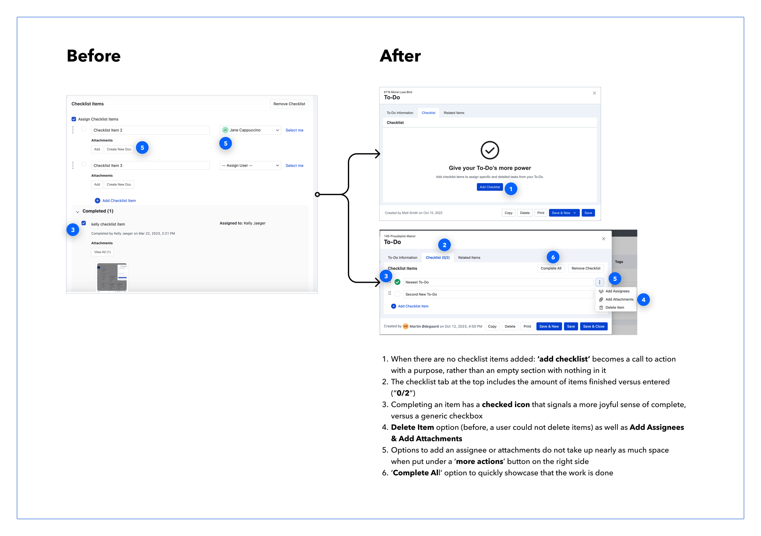
Click the image to see more details.
Alt-text for above photo:
When there are no checklist items added: ‘add checklist’ becomes a call to action with a purpose, rather than an empty section with nothing in it
The checklist tab at the top includes the amount of items finished versus entered (“0/2”)
Completing an item has a checked icon that signals a more joyful sense of complete, versus a generic checkbox
Delete Item option (before, a user could not delete items) as well as Add Assignees & Add Attachments
Options to add an assignee or attachments do not take up nearly as much space when put under a ‘more actions’ button on the right side
A ‘Complete All’ option to quickly showcase that the work is done
Final Solutions: Live in the Platform
The Modal
The To-Do Grid
Initial Product Feedback
“I love the quick add feature thing on the list page. I think it would be nice to have a drop-down to add tags on that page so I can organize the list more easily, especially if they could be color-coded.”
“Features like this are critical. If you could have a layout similar to microsoft planner or to-dos for each job then a to-do dashboard, it would be everything....”
“This is great. I would also suggest a feature to organize checklist in different sections.”
“Really looking forward to these more powerful options with to-dos, thanks!”
“I’m happy with the changes, I would just want to create the to-dos separately depending on the phase of the project. Basically subgroups.”
“I love the changes but is there any way to notify different users of the checklist for their items? That would make the section even more powerful.”
“I have used the function on the list page, yes. I found it very easy – love the ease and quickness of it. Saved a ton of time! The only bummer is that the To Do gets entered without being assigned to anyone. It would be great if there were “in line edits” available for Assigned To and Due Date (or even Tags! 😊). That would make it even more effective!”
“We just tried out the new checklist tab and we love all of the new features, but we do feel like they’re missing due date. So glad we finally delete them easily though, I remember how annoying that was!”